If you’ve followed along recently, you will know that I am planning to sign up with the Evolve Artist program to expand on my artistic skill set. Well, I am now enrolled and anxiously awaiting my first supply box for blocks 1 and 2. The journey has begun! As a result, the direction of this blog and my site at mindescapes.net will be transitioning to a more art related platform as I share more original works of art and some of the learning exercise results along the way.
To further support this initiative and represent the art works more directly, and to give me something to occupy my time while waiting for the course materials, I have updated my theme and layout. If you have a moment, any feedback on the new layout would be great. Simply head over to mindescapes.net for a look-see and reply below.
Teaser image:
Site layout 2021
Thank you for your time and for stopping by! Have a great day!
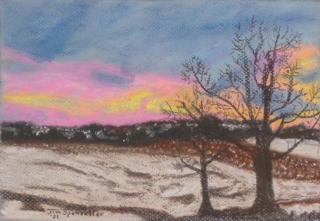
Welcome back to this art journey I’ve undertaken. After completing the flower pieces I talked about previously, I decided to try my hand at a landscape/sunset piece. I really love a good sunset and love to take photos of them as you are likely aware if you have followed along for awhile now, so I figured it would be a good subject choice.
I managed to do a few things right, and well, more things wrong. I feel it lacks a the flow of the land in the first snow covered field just behind the trees. The next field, where snow lays between rows of harvested corn stalks is a bit too dark. I do find the snow covered hills far off in the distance visible through woods and tree lines turned out nice. The sky has some nice colors but overall the blues I used were way too dark in comparison. They should be lights and be in the upper half of the color values but here they are darker than some foreground elements.
I mostly was happy with the piece though as overall it is pretty representative of the initial photo I was using as a reference. I chose a light blue hued pastel paper figuring it would show through for the sky better but the paper is so toothy I had to fight to cover the blue elsewhere in the image. If you look at the trees in the foreground you can see it showing through so I felt I was fighting the paper the whole way through. After I finished this piece I went searching on google for some additional information on pastel and landscapes. [Who asks for directions before you get lost? 😉 ]. I happened upon a wonderfully informative learning blog: Landscape Painting in Pastels by Deborah Secor. There is a wealth of information on painting landscapes using pastels with topics from additional helpful tools, how to select good pastels, and which surfaces work well. She discusses technique in laying down the pigments and points on various landscape elements. The site even provides the entire tutorial set as a PDF download free of charge! Thank you Deborah!
In the chapter on surfaces to use there was a segment on the very paper I have here at hand, which she expects most pastel artists use at least briefly in their art simply because it is affordable and readily available. This is cotton pastel paper in various shades by Canson, of which I have the 9″X12″ size. She mentions the toothy-ness issues and her own struggles with it:
“The screenlike grain on the front (the side that bears the watermark) left so many tiny holes in the painting that I often found myself blending too vigorously and far too often.” (Landscape Paintings In Pastel, Deborah Secor)
And is exactly the experience I am having too. She goes on to say that the back side texture is quite different and was softer, something my inexperienced self had not thought to explore. So I have since turned the paper over and am enjoying using it much much more. So if you have an interest in pastel painting, even if you don’t intend to paint landscapes, this book is a GREAT free learning tool that will help in so many ways. It is 142 pages long, laid out in 35 chapters and covers topics related to landscapes, color theory, pastel technique, selling art, getting gallery representation. The whole of topics in the career of pastel painting artist!
As for me, I moved on to a few portraits as I am still searching which subject category I am most drawn to by experimenting with many. Landscapes are sure to rank up there as I love landscape drops against sunsets. Sunsets, however, may be overly done since they are loved by many and may lack that bit of creative spark to draw the viewer into your painting, or so I have read in other search result content.
Next time I will talk a bit about my experiences with portraits in pastel so far. Until then, thanks for stopping by and may your travels through life be safe!
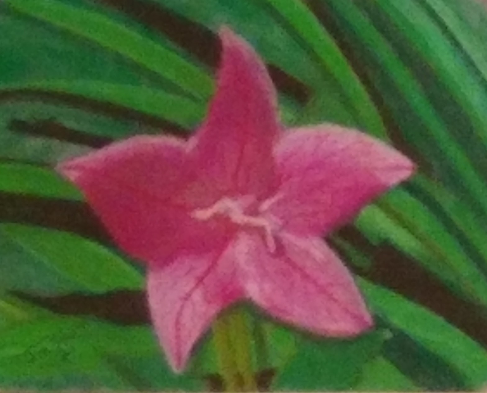
So, I tried to use the same starting image of the flower in purple but made a few adjustments. Turns out these changes all at once were a bit much and I lost some of the color depth and ended up getting the left side a bit out of proportion.
Apply in a sort of speed painting method – laying color to paper without the light scene sketch to start
Try a different set of colors from the reference image as a creative substitution
Deepen the shadows to capture the light and shadow regions better
Try to work with a bit less blending to keep the colors more sharp
Ultimately, most of the colors are good, the background is a bit more crisp and varied. The portion of the flower in the light is good but the veining tended a bit heavy. It could be a poor color choice…too much red. Speaking of color choices, I didn’t have a proper shade in my pastel kit to pull out the shadows so I added a bit of dark gray into the mix. A bit too much dark gray, and with blending to even it out kind of turned the shadow region a bit muddy with a lack of color variation. I think it resembles the shadows better than the flower in purple, but came at a loss of color depth so I am not as pleased.
Overall, it is a lovely piece in my somewhat biased opinion 😉 The picture here doesn’t do it much justice. I need to start using a better camera than my cell phone for these pictures. I am standing back a bit with the camera to reduce the texture and allow some visual color blending and using the camera zoom to achieve a larger image but it is blurring a bit much.
My next painting is going to be a landscape/sunset scene in winter. It is done and I will talk about it next time! Until then, have a great day and thanks for stopping by!
If you would like to commission some gradient filled digital line art images or just want to offer some support to this journey, simply head over and
Added a bit more detail and cleanup of the background, and added some detail to the flower itself with the stamen and veining. Quite happy with the end result, (end result? well, maybe after I touch up that one shadow here…)
Anyway, for comparison, here is the image of it I posted just a couple days ago.
These images are taken pretty close up and you can see the underlying paper texture but a few steps back appear nice and smooth.
Resulting picture is roughly 9×11…with a bit of matting it should fit nicely in a frame.