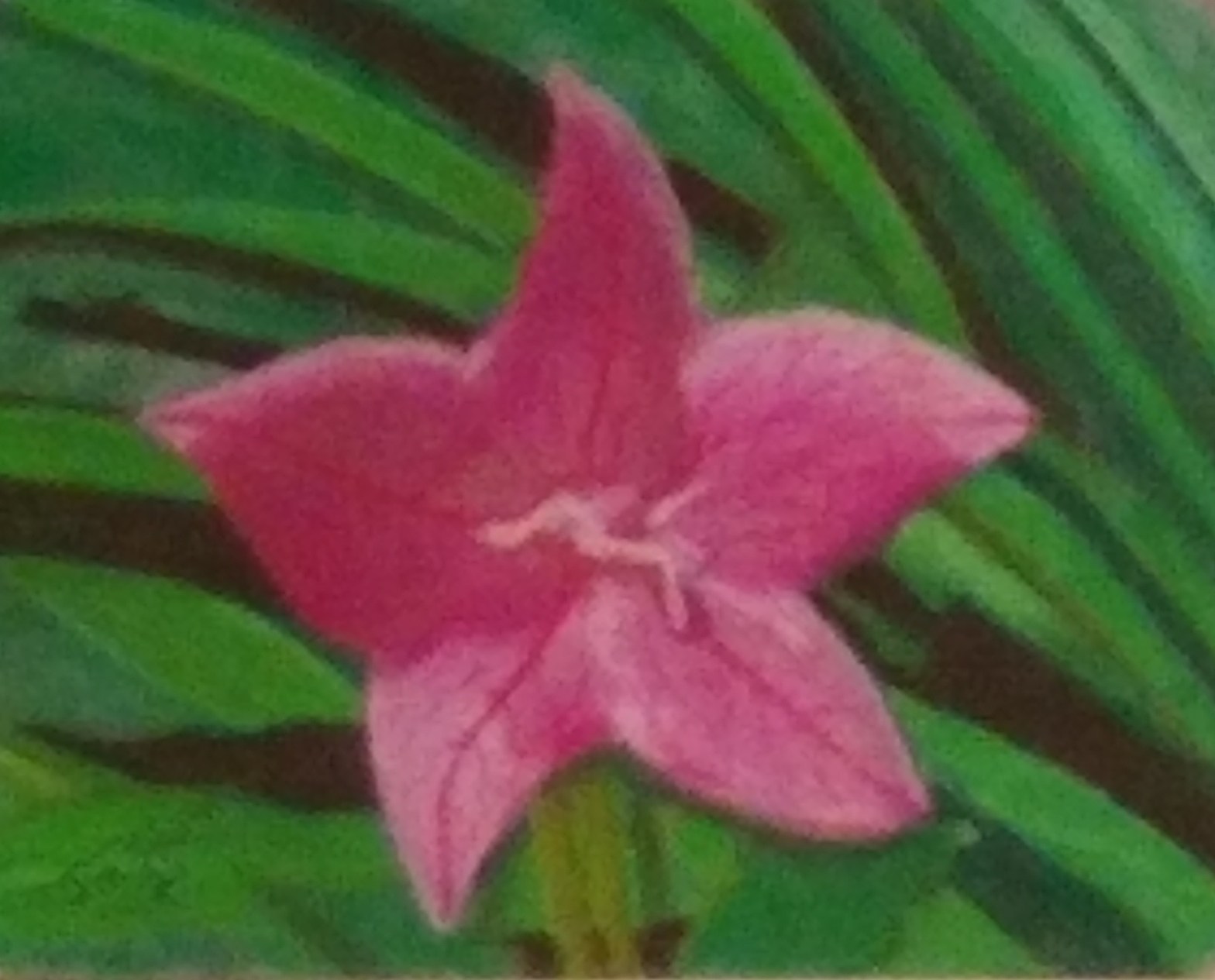

So, I tried to use the same starting image of the flower in purple but made a few adjustments. Turns out these changes all at once were a bit much and I lost some of the color depth and ended up getting the left side a bit out of proportion.
- Apply in a sort of speed painting method – laying color to paper without the light scene sketch to start
- Try a different set of colors from the reference image as a creative substitution
- Deepen the shadows to capture the light and shadow regions better
- Try to work with a bit less blending to keep the colors more sharp
Ultimately, most of the colors are good, the background is a bit more crisp and varied. The portion of the flower in the light is good but the veining tended a bit heavy. It could be a poor color choice…too much red. Speaking of color choices, I didn’t have a proper shade in my pastel kit to pull out the shadows so I added a bit of dark gray into the mix. A bit too much dark gray, and with blending to even it out kind of turned the shadow region a bit muddy with a lack of color variation. I think it resembles the shadows better than the flower in purple, but came at a loss of color depth so I am not as pleased.
Overall, it is a lovely piece in my somewhat biased opinion 😉 The picture here doesn’t do it much justice. I need to start using a better camera than my cell phone for these pictures. I am standing back a bit with the camera to reduce the texture and allow some visual color blending and using the camera zoom to achieve a larger image but it is blurring a bit much.
My next painting is going to be a landscape/sunset scene in winter. It is done and I will talk about it next time! Until then, have a great day and thanks for stopping by!
If you would like to commission some gradient filled digital line art images or just want to offer some support to this journey, simply head over and ![]()
Jim Sponseller – mindescapes.net – 2021

One thought on “Star Flower in Pink”